⇀ text
─────────────────

TEXT

sooo we're nearing the finish! bc now we're going to add text.
placement
there are a lot of different options for text placement, but always remember to put it where it's visible and fits in with the composition.
don't make the text too big or too small, it should draw some attention but not all. keep it the whole cover balanced nicely.
sadly i can't offer any „professional" instructions because when placing the title i always just go with my gut. but my tip would be: experiment around a lot with size, color, blending modes and placement until you find something that is balanced, compliments the cover and adds something to the composition without taking too much of the attention from the faceclaims!
here are some examples of text placement and style on my covers that i think have been done nicely along with some tips how to spice up your text! you can use these as an inspiration.
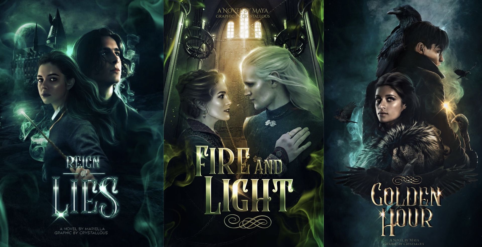
1 - use an emboss filter to get that 3d look and don't forget to add lense flares and flourishes.
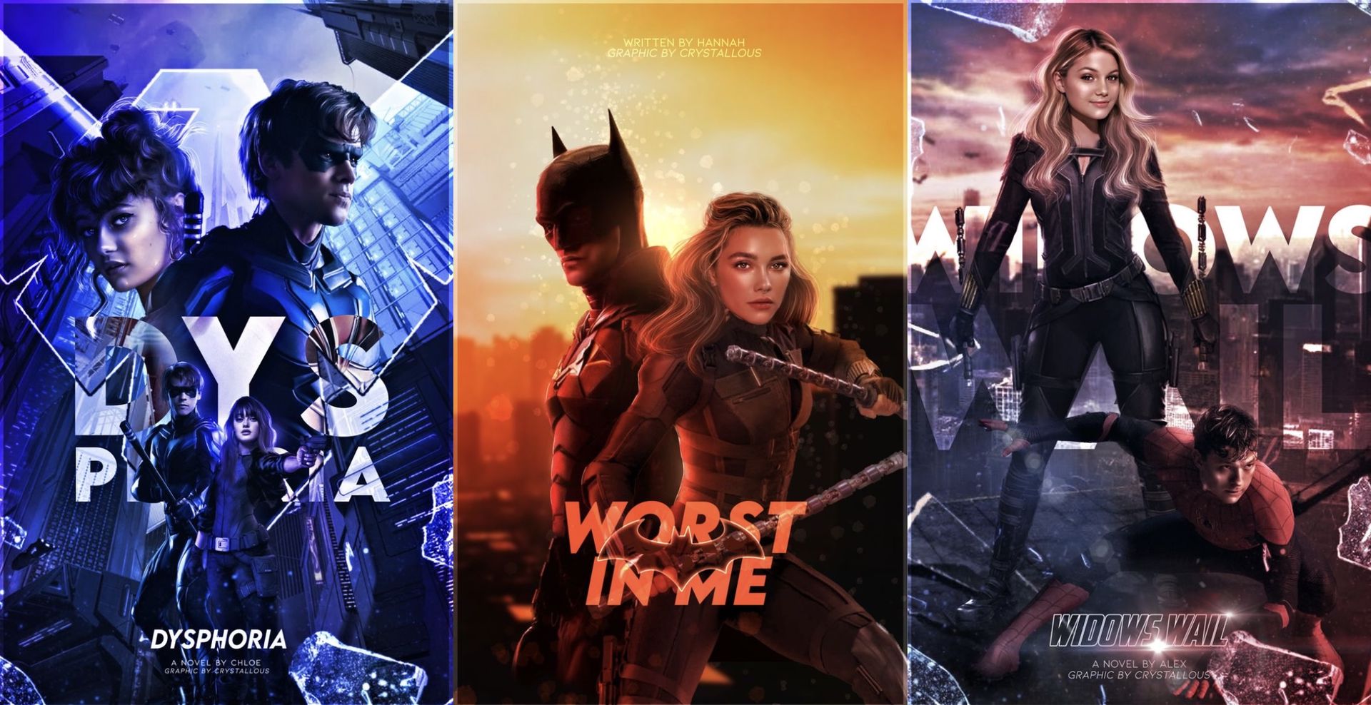
2 - position the text behind faceclaims or objects to make it more interesting.

3 - use the original font of shows and movies but give it a little twist.

4 - get that glassy look and use it in nice-fitting, bright colors!

5 - from left to right: place text off-center, use bold, striking colors that stand out more and play around with larger single letters.
for all the more advanced stuff (the emboss, glass look etc.) i'm working on chapters dedicated to these topics!
example
in my case i want to add text behind daenerys and the same text on the bottom, smaller though.
first i'll create a text layer behind the model. i'm using the font Lordish Regular and i'll put the text where i think it fits nicely.
for that use the text tool, there you can also change the font (i'll drop some nice ones in another chapter), the size, you can add a stroke and choose the color and also the spacing. more space between the letters gives subtitles a nice and professional look.
i'd always recommend duplicating your text layer and turning one layer off once you've done the positioning and want to start working with filters, in case you might need it later to change something.
now i want to color it according to my color scheme: one word in blue, one in yellow.
i want the text to be a bit glowy, so i'll set the blending mode to screen.

now onto the bottom text: i'll be using the same font and the same text, just a bit smaller. also i've added a filter (outer glow) and added the subtitle.
remember when adding a filter that the text layer will be rasterized. that means you cannot make any changes to the wording/spacing/ font later on. that's why i always duplicate my text layers before rasterizing them.
that's what it looks like in the end! i've made some minor corrections to the color scheme, lowered the saturation of the back text and also blurred the text a bit (filters -> gaussian blur).

even though this chapter was a little messy, i hope it helped you! text is a large topic with so many aspects to it, and we've barely scratched the surface but hopefully things will start to clear up more <3
『 space to drop any tips 』
─────────────────
Bạn đang đọc truyện trên: TruyenTop.Vip